What is a heat map?
A heat map is a graphical representation of data that uses a color-coded system to show
the density of data points in a given area. Heat maps are often used to visualize large
amounts of data, such as website traffic or weather patterns, in a way that is easy to
understand and interpret. There are two main types of heat maps:
2D heat maps
These heat maps display data on a two-dimensional grid, with each cell of the grid
representing a specific data point. The color of each cell corresponds to the value of
the data point, with warmer colors indicating higher values and cooler colors indicating
lower values.
3D heat maps
These heat maps display data in three dimensions, with the third dimension typically
representing the value of the data point. This type of heat map is often used to display
data in a more interactive and dynamic way, allowing users to rotate and zoom in on the
data for a better understanding of the patterns and trends.
Heat maps can be used for a variety of applications, such as:
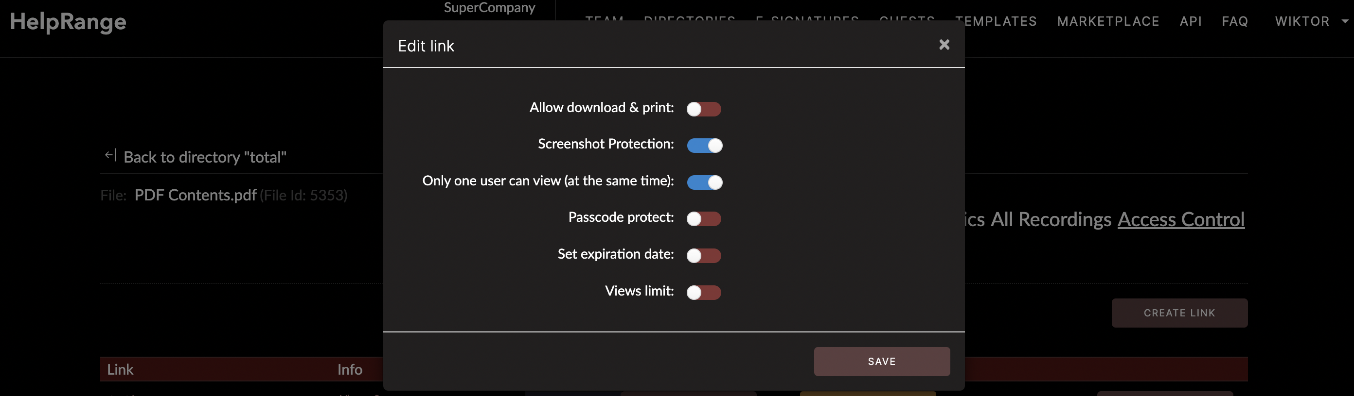
Limiting access
Some PDF editors and viewers allow you to set permissions for a document, such as
restricting who can view, print, or copy the contents of the file (specifically our
online tool HelpRange can help you in that). This can be useful
for preventing unauthorized access or sharing of sensitive information.
Website analytics
Heat maps can be used to visualize website traffic, such as where visitors are clicking
and how they are interacting with the site. This can help website owners and designers
understand how users are interacting with their site and make improvements accordingly.
Medical research
Heat maps can be used to visualize data from medical imaging studies, such as MRI or CT
scans, in order to help identify areas of the body that have been affected by disease or
injury.
Marketing
Heat maps can be used to understand consumer behavior and preferences by analyzing data
such as foot traffic in a physical store or clicks on an online ad.
Medical research: Heat maps can be used to visualize data from medical imaging
Social media analytics
Heat maps can be used to visualize data from social media platforms, such as likes,
shares,
and
comments, to understand user engagement and identify trends.
PDF analytics
Heat maps can be used to visualize usage of PDFs. We built HelpRange to show you such
heat
maps.
A Few Words Of Summary
Heat maps provide a quick and easy way to identify patterns and trends in large amounts
of data,
making them a valuable tool for understanding complex information in a visually
appealing way.
Check out HelpRange
HelpRange is "Next-Gen Data Room For Documents Protection & Analytics". HelpRange is a cutting-edge virtual data room platform for document access controls and in-depth analytics, ensuring superior management and usage insights for your documents.